Here in four-seasoned West Michigan the warm autumn nights finally transformed into crisp, gusty Fall days. This morning Simeon and I had a rare opportunity to catch breakfast sans kids and while walking the sidewalks to the cafe, I was blasted with tangible feels of autumn. The crunch of thin, crisply dried leaves under my shoes. The startling gusts of wind that blew around and through me, reminded me thin cotton shirts may as well be mesh and left me opting for an inside table. The deep autumn rust and gold leaves gleamed in sunlight against the quenchless gray rain clouds. All these beautiful and startling senses remind me I’m alive, here and now. And I’m grateful.
You often hear designers and architects talk about bringing nature indoors. Sometimes this is accomplished via colors or with a mix of textures. Other times it’s through minimalism in effort to showcase the view from the window. But for this room, I’m taking cues from the season of contrasts. Warm sun, brisk air. Bright leaves, muted skies. Frosted mornings, harvest afternoons.
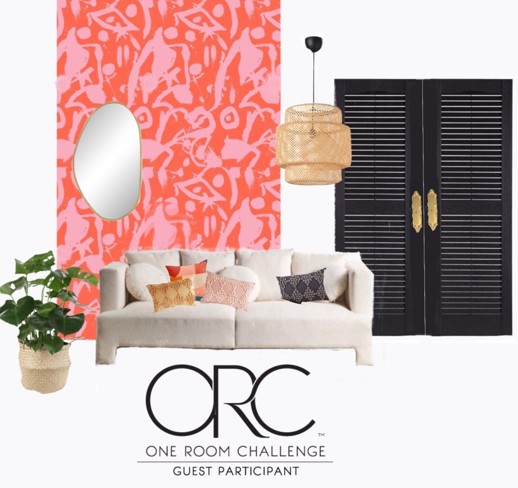
If you’re done with vaguely existential musings, here’s how autumn plays itself into the mood of this room: Black doors and frames meet orangey, red and pink. It’s the Contrast not the color. Wallpaper is up and doors are painted! I’m sticking with a very neutral furniture scheme, as is the carpet.
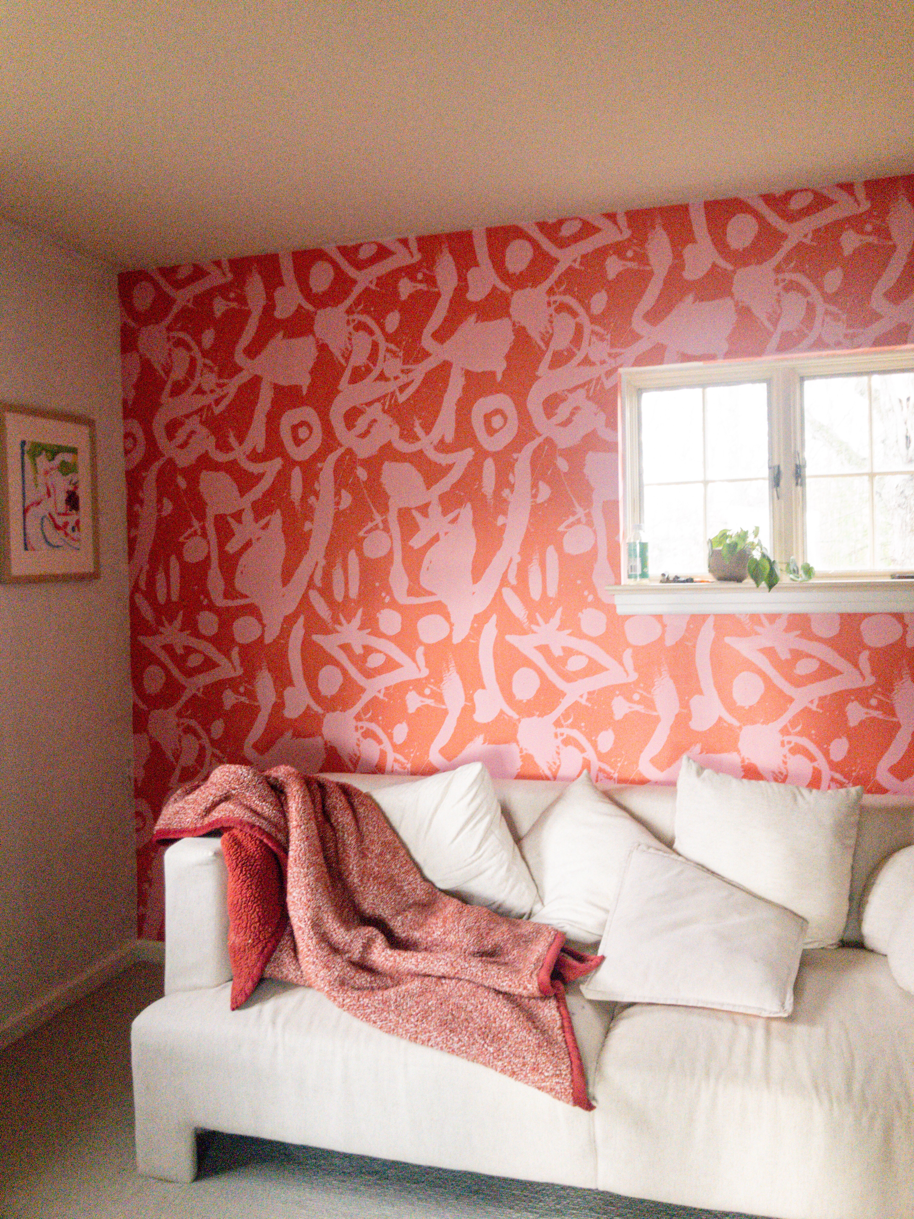
Can you handle!? Now add black closet and French doors to anchor the color contrast with the neutral backdrop and I’M. IN. LOVE.

This upcoming week my goal is to solidify lighting and paint color for the walls. The thin white primer doesn’t show well in the photos, but the walls need a basic color that subtly compliments the color smear. It’s turning out to be HARD! I’m thinking it will be a form of white.

Wrapped in a blanket sipping tea? You will find a ton of inspiration at the ORC blog… people are inspiringly creative. Or if you’re an insta-person, check out #orc. All the best images come up. Meanwhile, stay warm!


Leave a comment